Pace Check
A brief analysis of one of my runs tracked with the Strava App
If you’re a runner or cyclist, you probably use the mobile app Strava to track your workouts and analyze how you did. I’m a big fan of the app, but was disapointed to hear that they recently took away a few features for free, non-subscribing users. Even before that, free users had limited access to the workout analyses.
As users are legally entitled to access all data collected about them via the CCPA, I figured can analyze my own workouts!
Here is a brief example of a simple analysis- the goal being to create an interactive map where I can see my pace and other running metrics at different points along my run.
#import packages I will be using
import geopandas as gpd
import pandas as pd
import numpy as np
import fiona
import folium
from folium.plugins import *
import matplotlib.pyplot as plt
import datetime
Excersize data can be downloaded from the Strava Website. I have already downloaded a GPX file of one of my runs.
A GPX file is a geospatial file type, organized with an XML schema. I like to think of these as a file type that might be used by a GPS device: usually it has a start, an end, and intermediate points which are connected by line segments.
The GPX file had multiple layers, which we can read using the python library Fiona
path = '/Users/Jackson/Downloads/export_53889752/activities/3282057413.gpx'

fiona.listlayers(path)
['waypoints', 'routes', 'tracks', 'route_points', 'track_points']
Once we know what layers we need, we can read in the geospatial data with geopandas.
Here I am reading in a geodataframe called run which is a linestring- the line drawn tracking where I ran.
The second geodataframe is pings which contains the recorded points that comprise my run- these contain more information than just the path I took.
run = gpd.read_file(path, layer='tracks'
                   ).dropna(how='all', axis=1)

pings = gpd.read_file(path, layer='track_points'
                     ).dropna(how='all', axis=1)
run
| name | type | geometry | |
|---|---|---|---|
| 0 | Afternoon Run | 9 | MULTILINESTRING ((-122.40866 37.80628, -122.40... |
pings
| track_fid | track_seg_id | track_seg_point_id | ele | time | gpxtpx_TrackPointExtension | geometry | |
|---|---|---|---|---|---|---|---|
| 0 | 0 | 0 | 0 | 5.7 | 2020-04-10T20:30:49 | <gpxtpx:hr>188</gpxtpx:hr> | POINT (-122.40866 37.80628) |
| 1 | 0 | 0 | 1 | 5.7 | 2020-04-10T20:30:51 | <gpxtpx:hr>188</gpxtpx:hr> | POINT (-122.40856 37.80630) |
| 2 | 0 | 0 | 2 | 5.7 | 2020-04-10T20:30:53 | <gpxtpx:hr>188</gpxtpx:hr> | POINT (-122.40852 37.80630) |
| 3 | 0 | 0 | 3 | 5.7 | 2020-04-10T20:30:56 | <gpxtpx:hr>188</gpxtpx:hr> | POINT (-122.40849 37.80629) |
| 4 | 0 | 0 | 4 | 5.6 | 2020-04-10T20:30:58 | <gpxtpx:hr>188</gpxtpx:hr> | POINT (-122.40838 37.80623) |
| ... | ... | ... | ... | ... | ... | ... | ... |
| 1303 | 0 | 0 | 1303 | 3.8 | 2020-04-10T21:27:08 | <gpxtpx:hr>197</gpxtpx:hr> | POINT (-122.41043 37.80715) |
| 1304 | 0 | 0 | 1304 | 3.9 | 2020-04-10T21:27:11 | <gpxtpx:hr>205</gpxtpx:hr> | POINT (-122.41040 37.80706) |
| 1305 | 0 | 0 | 1305 | 3.9 | 2020-04-10T21:27:13 | <gpxtpx:hr>205</gpxtpx:hr> | POINT (-122.41038 37.80700) |
| 1306 | 0 | 0 | 1306 | 4.0 | 2020-04-10T21:27:16 | <gpxtpx:hr>207</gpxtpx:hr> | POINT (-122.41034 37.80691) |
| 1307 | 0 | 0 | 1307 | 4.0 | 2020-04-10T21:27:18 | <gpxtpx:hr>207</gpxtpx:hr> | POINT (-122.41031 37.80687) |
1308 rows × 7 columns
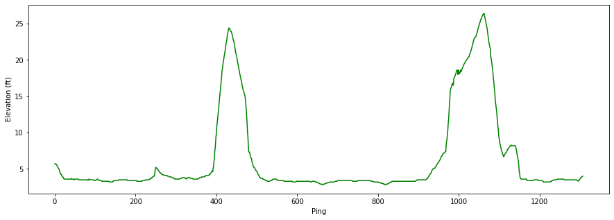
By playing around with the fields, we can surmise that pings.ele is my elevation at the time the ping was recorded.
pings.ele.plot(figsize=(15,5), c='g');
plt.ylabel('Elevation (ft)');
plt.xlabel('Ping');

On this run I went up and down one very steep hill, and passed it on my way back home. We can clearly see that in this plot.
(For my fellow San Franciscans, this is the big hill by Fort Mason).
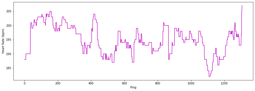
The field pings.gpxtpx_TrackPointExtension confused me at first- but after a quick google search I learned that this is just the GPX markup for heart rate!
We can easily extract the numerical values from the string field with regex
pings['hear_rate'] = pings.gpxtpx_TrackPointExtension.str.extract("<gpxtpx:hr>(\d{3})</gpxtpx:hr>").astype(int)
pings.hear_rate.plot(figsize=(15,5), c = 'm');
plt.ylabel('Heart Rate (bpm)');
plt.xlabel('Ping');

Now lets plot the geospatial data from the GPX file.
run.plot(figsize=(30,30));
plt.axis('off');

As you can see, the run geodataframe is just a long line.
pings.plot(markersize=.2, figsize=(30,30), c='red');
plt.axis('off');

Where as pings are a bunch of points- the dots that connect run.
pings has information about elevation, heart rate, date + time, and location. But it doesn’t have any field for pace or speed. If we want to inlcude pace in the final map, then we will need to calculate it between each point in pings.
We can calculate $time$ from the time field in pings by taking the time difference between each ping. We can calculate $distance$ from the geometery field in pings by taking the spatial difference between each ping. By dividing the two, we get $rate$, which is my running pace between each point. Ideally, this should be in Minutes Per Mile.
Currently, the spatial information in the GPX file is encoded in latitude, longitude format (more specifically, WGS 1984, a.k.a. EPSG:4326). The unit of measurement is decimal degrees, which can not be trivially transformed into a usual unit of euclidean distance, like we can between for example, meters and feet (see Haversine Distance). Before we calculate the distance between each ping, we need to transform our geogrpahic projection to one which uses meters as a unit of measurement, like EPSG:3857, which is similar to the Mercator projection.
pings.crs #current projection
{'init': 'epsg:4326'}
#switch projections to get euclidean distance
pings_in_meters = pings.to_crs({'init':'epsg:3857'})

# Get distance between consecutive points
pings['distance_meters'] = pings_in_meters.distance(pings_in_meters.shift(1))
pings.distance_meters.describe()
count    1307.000000
mean        9.576465
std         3.591159
min         0.222639
25%         7.288157
50%         9.189119
75%        11.309954
max        61.233098
Name: distance_meters, dtype: float64
# make sure the time stamp is properly reckognized
pings.time = pd.to_datetime(pings.time)

#get time in seconds between consecutive pings
pings['seconds_past'] = pings.time.diff().dt.total_seconds()
pings.seconds_past.describe()
count    1307.000000
mean        2.592961
std         0.631883
min         2.000000
25%         2.000000
50%         3.000000
75%         3.000000
max        11.000000
Name: seconds_past, dtype: float64
Right now, our distance is in terms of meters, and our time is in seconds, but we want this to be in terms of minutes per mile.
\[\frac{seconds}{meters} \rightarrow \frac{minutes}{mile}\] \[y\frac{seconds}{meters} \times \frac{1\ minute}{60\ seconds}\times \frac{1609.34\ meters}{1\ mile} = 26.822•y\frac{seconds}{meters}= x\frac{minutes}{mile}\]# calc running pace in minutes per mile
pings['pace'] = pings.seconds_past / pings.distance_meters * 26.8223333
# take the rolling average between every 3 pings to smooth measurement error
pings.pace = pings.pace.rolling(3, min_periods=1, center=True).mean()
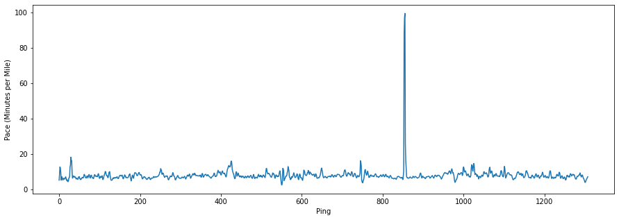
pings.pace.plot(figsize=(15,5));
plt.ylabel('Pace (Minutes per Mile)');
plt.xlabel('Ping');

By looking at the pace plot, there is a very large spike between ping number 800 and 1000. I don’t remember slowing down this much - it must be a some type of measurement error. Let’s take a closer look at the data…
pings[pings.pace>20]
| track_fid | track_seg_id | track_seg_point_id | ele | time | gpxtpx_TrackPointExtension | geometry | hear_rate | distance_meters | seconds_past | pace | |
|---|---|---|---|---|---|---|---|---|---|---|---|
| 853 | 0 | 0 | 853 | 3.3 | 2020-04-10 21:07:41 | <gpxtpx:hr>200</gpxtpx:hr> | POINT (-122.44066 37.80612) | 200 | 6.191066 | 3.0 | 88.511037 |
| 854 | 0 | 0 | 854 | 3.3 | 2020-04-10 21:07:43 | <gpxtpx:hr>200</gpxtpx:hr> | POINT (-122.44066 37.80612) | 200 | 0.222639 | 2.0 | 97.184678 |
| 855 | 0 | 0 | 855 | 3.3 | 2020-04-10 21:07:51 | <gpxtpx:hr>200</gpxtpx:hr> | POINT (-122.44065 37.80616) | 200 | 5.705720 | 8.0 | 99.513231 |
| 856 | 0 | 0 | 856 | 3.3 | 2020-04-10 21:07:56 | <gpxtpx:hr>200</gpxtpx:hr> | POINT (-122.44059 37.80617) | 200 | 6.711309 | 5.0 | 26.169628 |
These are the 4 pings that make up the anomoly. Nothing seems glaringly problematic. Lets see where these points lie on the geospatial plot.
#init fig and ax object
fig, ax = plt.subplots(figsize=(30,30))

#plot the pings in red
pings.plot(markersize=.2, c='r', ax=ax);

#get outlier pings, shown above
outlier_pings = pings[pings.pace>20]

#plot the outlier pings in green
outlier_pings.plot(markersize=5, c='g', ax=ax);

#plot a circle around the green outlier pings to highlight them
ax.scatter(x = outlier_pings.geometry.x.mean(),
           y = outlier_pings.geometry.y.mean(),
           marker='o',
           s=2000,
           facecolors='none',
           edgecolors='b'
          );

plt.axis('off');

After looking at where the anomaly happend (the green dots in the blue circle- the Marina Green), I remembered that I answered a phone call in the middle of my run and stopped moving for a few seconds! Looks like this was not a measurement error after all.
Lets keep moving forward to make the interactive map.
Now to make the interactive map using folium.
To color each line segment by my running pace, I use a branca colormap.
from branca import colormap

pace_cm = colormap.LinearColormap(['lightblue', 'lightgreen','yellow','orange', 'red'][::-1],
                                  vmin=pings.pace.quantile(.1).round(1),
                                  vmax=pings.pace.quantile(.9).round(1),
                                  caption='Pace Legend (Minutes per Mile)'
                                 )

pace_cm
Remember: lower pace value = running faster = hotter color
On the tooltip of the map, we want to have the pace be in the %Minutes:%seconds per mile format, instead of a decimal number of minutes. This strformatpace function makes it easy to do that.
def strformatpace(pace_in_min_decimals):

    #get the exact time diff
    delta_microsec_res = datetime.timedelta(minutes=pace_in_min_decimals)

    #round time diff to nearest second
    delta_second_res = datetime.timedelta(seconds = delta_microsec_res.seconds + (delta_microsec_res.microseconds > 5e5))

    #format as string, remove leading zeros
    out_str = str(delta_second_res)[2:]

    if out_str[0]=='0':
        out_str=out_str[1:]

    return out_str
# get starting map location
start = [run.centroid.y, run.centroid.x]

# init folium map
m = folium.Map(location=start, zoom_start=15, tiles='Carto db Positron')

# init a folium feature group to put line segments in
segments_between_pings = folium.FeatureGroup().add_to(m)

# iterate over rows of pings
for index, row in pings.iterrows():

    if index==0: continue #first row has not line segments

    #the coords of the polyline are the pings
    coords = [[pings.loc[index-1, 'geometry'].y, pings.loc[index-1, 'geometry'].x],
              [pings.loc[index, 'geometry'].y, pings.loc[index, 'geometry'].x]]


    folium.PolyLine(locations = coords,
                        weight = max(3, row.ele/2), # line thickness is elevation, min is 3 though
                        color=pace_cm(row.pace), # color map gradient for pace
                        tooltip=(f'<strong>Pace</strong>: {strformatpace(row.pace)}/mile<br>' #make tooltip to show info
                                 f'<strong>Elevation</strong>: {round(row.ele)} feet<br>'
                                 f'<strong>Heart Rate</strong>: {row.hear_rate} bpm'),
                        ).add_to(segments_between_pings) #add to feature group


pace_cm.add_to(m) # add the pace colormap as a legend

m # show map