Pace Check II
Further analysis of my longest run yet
Hopefully you have already checked out my first project, Pace Check, where I briefly analyzed of one of my runs tracked with the Strava App. This time, we are going to analyze my longest run: a half marathon across the Golden Gate Bridge!
Completing this run was a long term goal of mine, and a significant personal challenge to overcome. About three and a half years ago I shattered two bones in my left leg necessitating two surgeries. As a result, it is very difficult and painful to train. But that’s enough complaining- let’s get started!
Instead of downloading my running data like last time, I decided to connect to Strava using the developer API instead. For this project I used the ready-to-go Python client, stravaio. Once I created a Strava API application I passed my credentials to the client, which returns my access token (this is secret so I won’t be sharing it here). Now I can use the client to access my Strava account information, like recent runs.
from stravaio import StravaIO
client = StravaIO(access_token=access_token)

recent_runs_list = client.get_logged_in_athlete_activities(after='last month')
Fetched 6, the latests is on 2020-06-11 01:48:10+00:00
# take a look at one of the runs
recent_runs_list[0]
{'achievement_count': 11,
 'athlete': {'id': 53889752},
 'athlete_count': 1,
 'average_speed': 3.022,
 'average_watts': None,
 'comment_count': 0,
 'commute': False,
 'device_watts': None,
 'distance': 10511.1,
 'elapsed_time': 3492,
 'elev_high': 27.0,
 'elev_low': 2.8,
 'end_latlng': [37.81, -122.41],
 'external_id': '8FBE8D55-6D19-4BF3-B487-1FDCBC80C30F',
 'flagged': False,
 'gear_id': None,
 'has_kudoed': False,
 'id': 3482935194,
 'kilojoules': None,
 'kudos_count': 0,
 'manual': False,
 'map': {'id': 'a3482935194',
         'polyline': None,
         'summary_polyline': 'waweF~tbjVGc@OKa@Cw@DKDIFELER@NAPGLWPIAk@Fi@r@INId@Q^IT[rBEd@?RG^?v@In@@f@ETGr@BbAI`@Cz@I`@I|@BL?RMz@BpAMJF\\?VHv@TvCBZEr@Bl@Nt@ATTfBNn@L~AJ|CR~@Fx@NbAAPBv@Hr@NzCJdADrADn@BtBDp@PvAd@hB`@dAd@z@HVx@`BHf@?lBKfAo@pC[bAAr@CHIHWLYRm@V_@HcANw@By@LyACeBM}@Yc@W_A}@[e@O]O{@G}AFk@La@D]G@Oz@?x@H~@DT^z@bAxALLr@f@t@^v@PZDpAA~AMT@Fr@@nAC^[xBC`A{@jB@n@Od@NIrAsBRUH@PJ\\n@^^LPNHh@l@LFv@Lh@AJBZVd@f@FN\\t@b@t@NN\\Zt@\\d@^HDj@JHABRA\\Q|@KJKDORg@vAOv@Gb@Ax@NzBIRS\\KB[Dc@RQDgARu@FULEVLp@Bb@HbAOpAMN_@FQLa@JKFGFKn@HdAHb@RdDJh@@fCBPHtBZlDDbADTDhARjBFrAFv@FVHNLHz@JL?TEFBBHT~CJz@LnC`@vEBhANvAFxAAh@HbBARWFWAWB_A\\WT_@t@g@t@EJ?RFdA?j@DZ^vAh@d@HLBPJvAT|FR~AFn@ANEJEBSOKQSqA[gGEqBIkAEa@i@qBQmA@OB_@HOj@u@`@a@d@m@JKZGXMv@EFI?IQaBk@uLWgCYaEImBMmAKoCK}AG}AGw@EsAYkDWqBa@cF?iAKmACMt@kBj@u@j@eAn@y@fBcDJ[Da@?aAOqBQsA?m@BI`B}@DOV@HVVVd@ZXOTYVOPG~@IFEBIi@mE@QCYMw@QoBC{@Bi@AkAB[Ke@C}@Ks@CgAg@}F?{@ESC{@C[GUKUGE]DWAq@@e@Hm@Rg@Fw@@k@\\_AXM@KIAMK_@Ag@F]Zm@J[Js@[wDSe@Om@m@}AQWu@q@QS]u@Io@GMCQG{@WcAKq@Bk@Ao@Ey@Km@EwBQgBE}BEa@YaAYeDE_AKe@EsASyBE{AGi@EaBMuAIiB?qAVoDVcBHKHAp@Bb@Cj@Yb@MNYZQ'},
 'max_speed': 13.3,
 'max_watts': None,
 'moving_time': 3478,
 'name': 'Afternoon Run',
 'photo_count': 0,
 'private': False,
 'start_date': datetime.datetime(2020, 5, 19, 23, 41, 31, tzinfo=tzutc()),
 'start_date_local': datetime.datetime(2020, 5, 19, 16, 41, 31, tzinfo=tzutc()),
 'start_latlng': [37.81, -122.41],
 'timezone': '(GMT-08:00) America/Los_Angeles',
 'total_elevation_gain': 52.3,
 'total_photo_count': 0,
 'trainer': False,
 'type': 'Run',
 'upload_id': 3719530643,
 'weighted_average_watts': None,
 'workout_type': 0}
#each run has a customized object
type(recent_runs_list[0])
swagger_client.models.summary_activity.SummaryActivity
# we want to make each run a dictionary to make it easier to navigate
recent_runs = [run.to_dict() for run in recent_runs_list]
Ok, so in the past month I have completed a handful of runs- but which is the one we want to analyze? Lets throw these in a dataframe so it is easy to view and see which run was the longest.
import pandas as pd
pd.options.display.max_columns = 50 #show more columns so we can see all of them

#have pandas parse each nested dictionary it into a flat dataframe
recent_runs = pd.json_normalize(recent_runs)
recent_runs
| id | external_id | upload_id | name | distance | moving_time | elapsed_time | total_elevation_gain | elev_high | elev_low | type | start_date | start_date_local | timezone | start_latlng | end_latlng | achievement_count | kudos_count | comment_count | athlete_count | photo_count | total_photo_count | trainer | commute | manual | private | flagged | workout_type | average_speed | max_speed | has_kudoed | gear_id | kilojoules | average_watts | device_watts | max_watts | weighted_average_watts | athlete.id | map.id | map.polyline | map.summary_polyline | |
|---|---|---|---|---|---|---|---|---|---|---|---|---|---|---|---|---|---|---|---|---|---|---|---|---|---|---|---|---|---|---|---|---|---|---|---|---|---|---|---|---|---|
| 0 | 3482935194 | 8FBE8D55-6D19-4BF3-B487-1FDCBC80C30F | 3719530643 | Afternoon Run | 10511.1 | 3478 | 3492 | 52.3 | 27.0 | 2.8 | Run | 2020-05-19 23:41:31+00:00 | 2020-05-19 16:41:31+00:00 | (GMT-08:00) America/Los_Angeles | [37.81, -122.41] | [37.81, -122.41] | 11 | 0 | 0 | 1 | 0 | 0 | False | False | False | False | False | 0 | 3.022 | 13.3 | False | None | None | None | None | None | None | 53889752 | a3482935194 | None | waweF~tbjVGc@OKa@Cw@DKDIFELER@NAPGLWPIAk@Fi@r@... |
| 1 | 3531392033 | C1844A33-AC45-4635-A3E4-E255C9EA3BB3 | 3770681834 | Afternoon Run | 10371.6 | 3303 | 3308 | 44.3 | 26.4 | 2.8 | Run | 2020-05-28 22:49:49+00:00 | 2020-05-28 15:49:49+00:00 | (GMT-08:00) America/Los_Angeles | [37.81, -122.41] | [37.81, -122.41] | 14 | 0 | 0 | 1 | 0 | 0 | False | False | False | False | False | 0 | 3.140 | 5.4 | False | None | None | None | None | None | None | 53889752 | a3531392033 | None | aaweFjvbjVEq@I]SKQ?cALUHy@[MJKPQf@?j@EP_@dAUbA... |
| 2 | 3539038874 | E3A4EF8B-4F1B-4B08-A14F-2CA099AD95DB | 3778792319 | Afternoon Run | 10627.6 | 3473 | 3477 | 44.5 | 26.4 | 2.8 | Run | 2020-05-30 21:32:42+00:00 | 2020-05-30 14:32:42+00:00 | (GMT-08:00) America/Los_Angeles | [37.81, -122.41] | [37.81, -122.41] | 6 | 0 | 0 | 1 | 0 | 0 | False | False | False | False | False | 0 | 3.060 | 5.9 | False | None | None | None | None | None | None | 53889752 | a3539038874 | None | }aweF`sbjVQIUPg@FMDs@rAo@Lc@d@O^On@OVe@jB[rAGn... |
| 3 | 3569837822 | C7E58F91-7061-4501-9156-4BED2951D572 | 3811441999 | Afternoon Run | 21600.7 | 7599 | 7616 | 172.7 | 81.6 | 2.4 | Run | 2020-06-05 23:03:35+00:00 | 2020-06-05 16:03:35+00:00 | (GMT-08:00) America/Los_Angeles | [37.81, -122.41] | [37.81, -122.41] | 12 | 3 | 0 | 1 | 0 | 0 | False | False | False | False | False | 0 | 2.843 | 14.0 | False | None | None | None | None | None | None | 53889752 | a3569837822 | None | gbweF~ubjVMkAmBPkAhCWX]H[n@a@`BUxAm@dGHn@Q`F]x... |
| 4 | 3588262984 | 72185A79-B7F0-48DB-92CC-4146885D1F50 | 3830875861 | Afternoon Run | 5878.5 | 1830 | 1833 | 32.5 | 26.9 | 3.3 | Run | 2020-06-09 00:25:17+00:00 | 2020-06-08 17:25:17+00:00 | (GMT-08:00) America/Los_Angeles | [37.81, -122.41] | [37.81, -122.41] | 7 | 0 | 0 | 1 | 0 | 0 | False | False | False | False | False | 0 | 3.212 | 5.4 | False | None | None | None | None | None | None | 53889752 | a3588262984 | None | qaweFtubjVKi@g@WO?s@^UVi@B_@h@Uv@e@dASv@e@nA[|... |
| 5 | 3600201601 | 96F1DBC2-E315-41A4-997A-6E1C264F0596 | 3843441386 | Evening Run | 4156.6 | 1340 | 1344 | 44.2 | 27.1 | 3.6 | Run | 2020-06-11 01:48:10+00:00 | 2020-06-10 18:48:10+00:00 | (GMT-08:00) America/Los_Angeles | [37.81, -122.41] | [37.81, -122.42] | 0 | 1 | 0 | 1 | 0 | 0 | False | False | False | False | False | 0 | 3.102 | 5.9 | False | None | None | None | None | None | None | 53889752 | a3600201601 | None | {mweFnicjVJ~@CVMx@QbCI^]p@M`@DNHBRTPhALtCHb@B`... |
Lets also plot a bar chart of the distance for each run.
recent_runs.set_index('id').distance.plot(kind='bar',
                                          figsize=(12,6),
                                          legend=True);
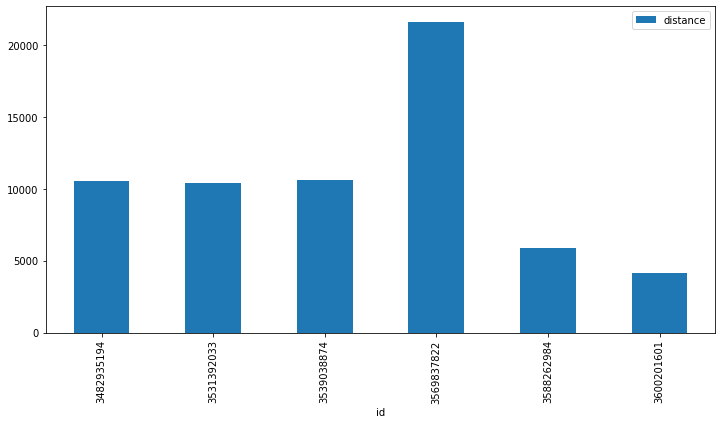
Clearly the run with id of 3569837822 had a much larger distance than the other runs, so this must be the one we are looking for.
# mask out recent runs data frame to show only the run with the max distance
longest_run = recent_runs[recent_runs.distance == recent_runs.distance.max()].dropna(axis=1).iloc[0]
longest_run
id                                                             3569837822
external_id                          C7E58F91-7061-4501-9156-4BED2951D572
upload_id                                                      3811441999
name                                                        Afternoon Run
distance                                                          21600.7
moving_time                                                          7599
elapsed_time                                                         7616
total_elevation_gain                                                172.7
elev_high                                                            81.6
elev_low                                                              2.4
type                                                                  Run
start_date                                      2020-06-05 23:03:35+00:00
start_date_local                                2020-06-05 16:03:35+00:00
timezone                                  (GMT-08:00) America/Los_Angeles
start_latlng                                             [37.81, -122.41]
end_latlng                                               [37.81, -122.41]
achievement_count                                                      12
kudos_count                                                             3
comment_count                                                           0
athlete_count                                                           1
photo_count                                                             0
total_photo_count                                                       0
trainer                                                             False
commute                                                             False
manual                                                              False
private                                                             False
flagged                                                             False
workout_type                                                            0
average_speed                                                       2.843
max_speed                                                              14
has_kudoed                                                          False
athlete.id                                                       53889752
map.id                                                        a3569837822
map.summary_polyline    gbweF~ubjVMkAmBPkAhCWX]H[n@a@`BUxAm@dGHn@Q`F]x...
Name: 3, dtype: object
It seems that the API gives us a lot more fields than we had when we downloaded the data directly in Pace Check. The big difference is that when we downloaded data directly, it was already in GPX format and had the geospatial information built in.
The geospatial information is given to us by the API here, but it is not obvious. The Strava developer docs explain that lines are encoded using the Google encoded polyline algorithm.
“Polyline encoding is a lossy compression algorithm that allows you to store a series of coordinates as a single string.”
This algorithm provides an efficient way to represent a series of points by encoding the start point, and then giving the next point by the difference from the first point, and so on. We can see the encoded polyline under map.summary_polyline
polyline_str = longest_run['map.summary_polyline']
polyline_str
'gbweF~ubjVMkAmBPkAhCWX]H[n@a@`BUxAm@dGHn@Q`F]xAMv@Pp@b@rGKvDDj@h@fDT~DTlBD`B`@lBJtAd@tBDxAXz@AlERZp@vCbBlENv@EvDOTUpAs@fBGr@_Ax@uBf@QbANnAe@|AYVK`@BXPf@lA~@DrAX`@t@AZaA^B\\TfAA~Aj@p@bBAd@d@tBjCrBNd@MlAe@j@i@hCGtALrAQrAg@j@yALmCj@I`@RpEwAr@UXClAr@`KRbBr@bOVfCFTTLhBLLPpBp\\?ZKNiCp@{@zA\\zAAjAx@xJVlGHf@h@h@h@lAd@rBp@dAvAlAb@rAj@tFn@~J`@lI`@dBjArBX|AmAzWa@dDOlDUfBFl@`@pAW`BUn@yBtBq@rAs@b@WMoBBOMa@qAWABjBk@zBoBrDi@LuCxCa@xACv@P~AeA|Cc@`Eq@j@Yx@Ft@Vb@HBIq@JQJBh@hA@f@y@`A{CbAqAN_A\\u@O{BPo@MoE@eANw@p@_AR_CRuQr@{Gt@uDJW]WmEMk@OVGIq@Vw@v@{AvDGRD@uAeB{AMy@ZeAbBkAf@ZIy@RqJb@iBZmAJaTz@uD?aATgCPm@zCYJe@Y]@i@UYg@I?c@J_DrBgBNOy@Z}Bf@cAl@Yh@FZ^D`@Gx@w@dCbCmBxBeA|Cg@nKc@bPaAz@UdAOjE[tDMnA_@~AJxCUrECbDc@fJW|Hg@EETKzGYfBW\\P~JaAtMc@fC[`A_@vCuBDS_@e@OeA[BWXXx@e@sBTy@f@UZ_@BaA\\oCXaAf@q@]sAAe@tAcDxAeBnAs@nBoF]IYJiAfAcAbBoAr@aCj@c@SCs@Zo@l@cDf@eAtCwBhBu@r@i@lBgCnBwD^qAHkFF]n@s@GqAHaCCr@HNINB]g@sGGuDAcJu@}Hm@sHBo@YwDBi@NSHk@Ws@OaBL{A_AqGAiB{@oEI}CW}B{@`AZy@DYIcAf@qDTs@v@yA^]r@QRi@a@_EM}Cq@oHKkDi@_G[aHuAqRGaDN_Av@eBpCuEz@uBLaAa@cFBkAvFsArBAJY_@}Ba@kDSuC?wBSsBGqEK{AQc@SiEgD^Uk@WEiC@gAl@WWEiAb@oBJaBKyAMs@aA}B{BgCSm@ImA]eBq@}KMeGu@kDHqAcBmSOs@h@sENiCfA?r@k@~Cm@'
Encoded, this seems like complete nonsense. But we can easily decode this using the polyline python package .
import polyline

route = polyline.decode(polyline_str)
route[:10]
[(37.8066, -122.40752),
 (37.80667, -122.40714),
 (37.80722, -122.40723),
 (37.8076, -122.40792),
 (37.80772, -122.40805),
 (37.80787, -122.4081),
 (37.80801, -122.40834),
 (37.80818, -122.40883),
 (37.80829, -122.40928),
 (37.80852, -122.41059)]
Success! These look like latitude-longitude pairs. Let’s throw them into a geodataframe and plot it.
from shapely.geometry import LineString
import geopandas as gpd

longest_run = gpd.GeoDataFrame(longest_run.to_frame().T, #make run a single record data frame again
                          geometry = [LineString([p[::-1] for p in route])], #make linestring from points, reverse order so it is long-lat, not lat-long
                          crs={'init':'epsg:4326'}) #universal lat-long coords are always in epsg:4326

longest_run.plot();
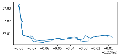
Well that looks about right! Lets throw it on a folium map.
import folium

m = folium.Map(location = [longest_run.centroid.y, longest_run.centroid.x],
              tiles='Carto db Positron',
              zoom_start=13)

folium.GeoJson(data=longest_run.geometry
              ).add_to(m)

m
Fantastic. That is definitely the route I took. You can see that I went across the bridge and back. Clearly there is some sort of measurement error as it looks like I was running over the ocean around the middle of the bridge area.
The down side with this geospatial information is that we dont have information about each ping, like we did in the last project. I would like to know how metrics like pace and elevation varied through out the run, but longest_run only has information about the run as a whole.
To get the information about each individual ping made while on my run, we have to use the Streams endpoint of the Strava API.
run = client.get_activity_streams(id = 3569837822,
                            athlete_id = 53889752)

run = pd.DataFrame(run.to_dict())

run
| time | distance | altitude | velocity_smooth | heartrate | moving | grade_smooth | lat | lng | |
|---|---|---|---|---|---|---|---|---|---|
| 0 | 0 | 0.0 | 4.7 | 0.0 | 172 | False | -1.4 | 37.806600 | -122.407517 |
| 1 | 5 | 13.5 | 4.4 | 2.7 | 172 | True | -2.3 | 37.806618 | -122.407366 |
| 2 | 8 | 21.4 | 4.4 | 2.7 | 172 | True | -1.8 | 37.806646 | -122.407257 |
| 3 | 10 | 30.0 | 4.0 | 3.3 | 172 | True | -1.3 | 37.806672 | -122.407184 |
| 4 | 13 | 39.8 | 4.0 | 3.7 | 172 | True | -1.5 | 37.806677 | -122.407131 |
| ... | ... | ... | ... | ... | ... | ... | ... | ... | ... |
| 2909 | 7604 | 21565.7 | 4.2 | 3.7 | 182 | True | 0.6 | 37.807304 | -122.410505 |
| 2910 | 7607 | 21573.1 | 4.3 | 3.3 | 182 | True | 0.7 | 37.807224 | -122.410500 |
| 2911 | 7609 | 21580.1 | 4.3 | 2.9 | 182 | True | 0.7 | 37.807185 | -122.410498 |
| 2912 | 7612 | 21587.2 | 4.4 | 2.8 | 182 | True | 0.5 | 37.807128 | -122.410467 |
| 2913 | 7614 | 21592.9 | 4.4 | 2.6 | 181 | True | 0.8 | 37.807069 | -122.410445 |
2914 rows × 9 columns
That was easy! Now we already have a nice clean dataframe with speed already calculated, and latitude and longitude for each point explicitly handed to us.
run.altitude.plot();
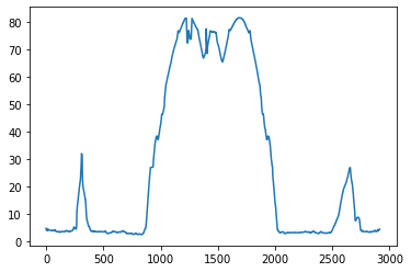
The altitude plot shows smaller spikes on the side (over fort mason and back) and the large spike in the middle (the golden gate bridge). It is pretty shocking how much the altitude changes across the bridge.
run.grade_smooth.plot();
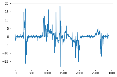
This dataframe has a few new features. One is called grade_smooth, which I am guessing is the rate of change of the altitude, an approximation of the derivative. We can approximate this calculation ourselves using the pandas methods .diff to take the difference between consecutive values and then .rolling() to group up consecutive points and aggregate (in this case I took the running average). Mathematically speaking we are calculating the numerator of the Difference Quotient, neglecting the denominator value by assuming the difference in how far I have ran between each point is roughly the same.
run.altitude.diff(1).rolling(10).mean().plot();
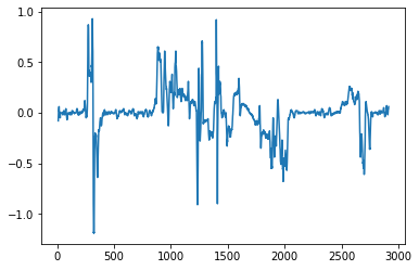
The two plots look nearly identitcal, so we are probably correct about what grade_smooth is.
Recently I saw that Strava offered an interesting metric to paying users: Grade Adjusted Pace.
“Grade Adjusted Pace estimates an equivalent pace when running on flat land, allowing the runner to compare hilly and flat runs more easily. Because running uphill requires extra effort, the Grade Adjusted Pace will be faster than the actual pace run. When running downhill, the Grade Adjusted Pace will be slower than the actual pace.”
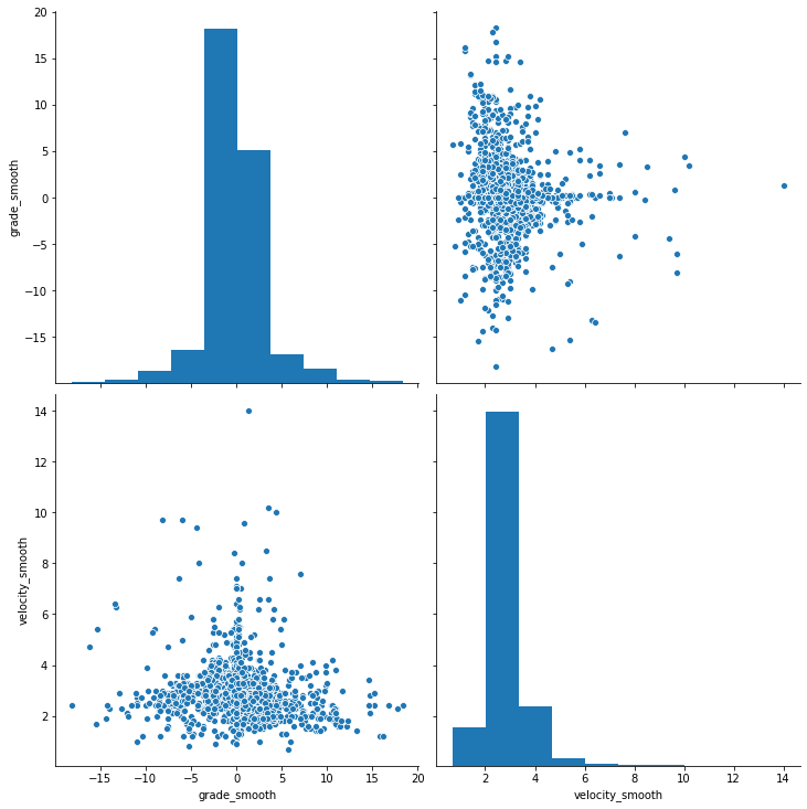
Interesting… I wonder how much the grade I am running on actually affects my pace. Let’s observe the relationship between velocity_smooth from grade_smooth.
import seaborn as sns
sns.pairplot(run.loc[run.moving, ['grade_smooth', 'velocity_smooth']], height=5);
sns.regplot(x="grade_smooth", y="velocity_smooth", data=run[run.moving]);
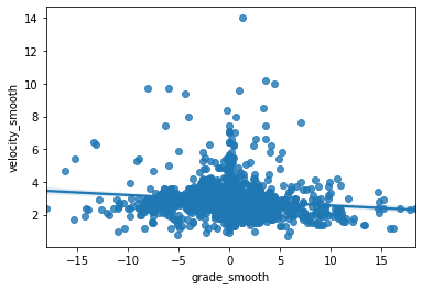
There doesn’t seem to be a particularly strong correlation between the two features. Lets take a deeper dive into the metrics with Statsmodels
import numpy as np
import statsmodels.api as sm
import statsmodels.formula.api as smf

# Fit a simple regression model
results = smf.ols('velocity_smooth ~ grade_smooth', data=run[run.moving]).fit()

print(results.summary())
                            OLS Regression Results
==============================================================================
Dep. Variable:        velocity_smooth   R-squared:                       0.015
Model:                            OLS   Adj. R-squared:                  0.014
Method:                 Least Squares   F-statistic:                     42.86
Date:                Mon, 15 Jun 2020   Prob (F-statistic):           6.92e-11
Time:                        19:59:19   Log-Likelihood:                -3528.4
No. Observations:                2899   AIC:                             7061.
Df Residuals:                    2897   BIC:                             7073.
Df Model:                           1
Covariance Type:            nonrobust
================================================================================
                   coef    std err          t      P>|t|      [0.025      0.975]
--------------------------------------------------------------------------------
Intercept        2.8809      0.015    189.675      0.000       2.851       2.911
grade_smooth    -0.0317      0.005     -6.547      0.000      -0.041      -0.022
==============================================================================
Omnibus:                     2315.926   Durbin-Watson:                   0.537
Prob(Omnibus):                  0.000   Jarque-Bera (JB):            96762.680
Skew:                           3.453   Prob(JB):                         0.00
Kurtosis:                      30.448   Cond. No.                         3.14
==============================================================================

Warnings:
[1] Standard Errors assume that the covariance matrix of the errors is correctly specified.
As one might expect, the coefficient for grade_smooth is negative, mean the higher the grade, the slower I usually run. However, the resulting $R^2$ is very low meaning that the grade I am running on explains very little of the variance in my pace. But, the low p-value lets us reject the null hypothesis that grade has no effect on my pace. In conclusion, the grade I am running on definitely negatively affects my pace, but not in a consistently predictable way.
We can compute our own grade adjusted pace by compensating the real pace by how much we predict the grade to affect it.
#                               grade      *    OLS ceof (-0.0317)
predicted_change_in_pace = run.grade_smooth*results.params.grade_smooth

run['grade_adjusted_pace'] = run.velocity_smooth + predicted_change_in_pace
import matplotlib.pyplot as plt

fig, ax = plt.subplots(figsize=(15,10))

run.grade_smooth.apply(lambda x: (x-run.grade_smooth.mean()) / run.grade_smooth.var(ddof=0)
                      ).plot(ax=ax, alpha=.75, label='Grade (normalized)');

predicted_change_in_pace.plot(ax=ax, alpha=.75, label='Predicted change in pace');

ax.legend(prop={'size': 15});
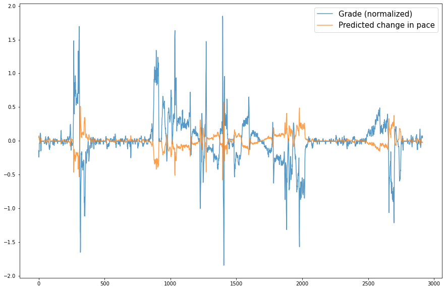
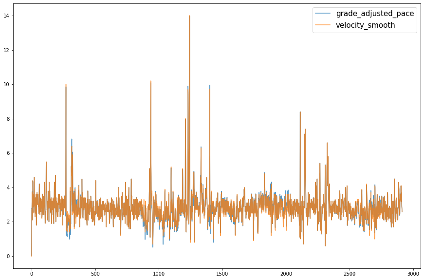
Although, when plotted together, there seems to be little difference between my actual pace and the grade adjusted pace.
fig, ax = plt.subplots(figsize=(15,10))

run.grade_adjusted_pace.plot(ax=ax, alpha=.75);
run.velocity_smooth.plot(ax=ax, alpha=.75);

ax.legend(prop={'size': 15});
fig, ax = plt.subplots(figsize=(15,10))

(run.grade_adjusted_pace - run.velocity_smooth).plot(ax=ax, alpha=.75);

ax.set_title('grade_adjusted_pace - velocity_smooth');
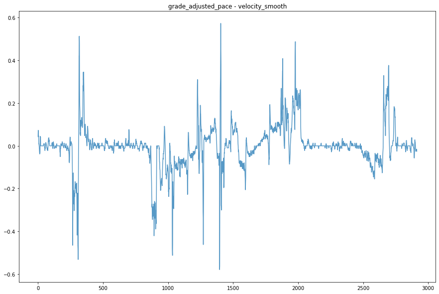
Having been the one who actually did this run, I think the strong winds affected my pace much more than the grade I was running on (I happened to run on one of the windiest I have seen). It would be interesting to compare pace with wind speed data, but I am not sure where I would be able to find it at the granularity I would require (down to the location with speed and direction).